PORTFOLIO
Understanding the user
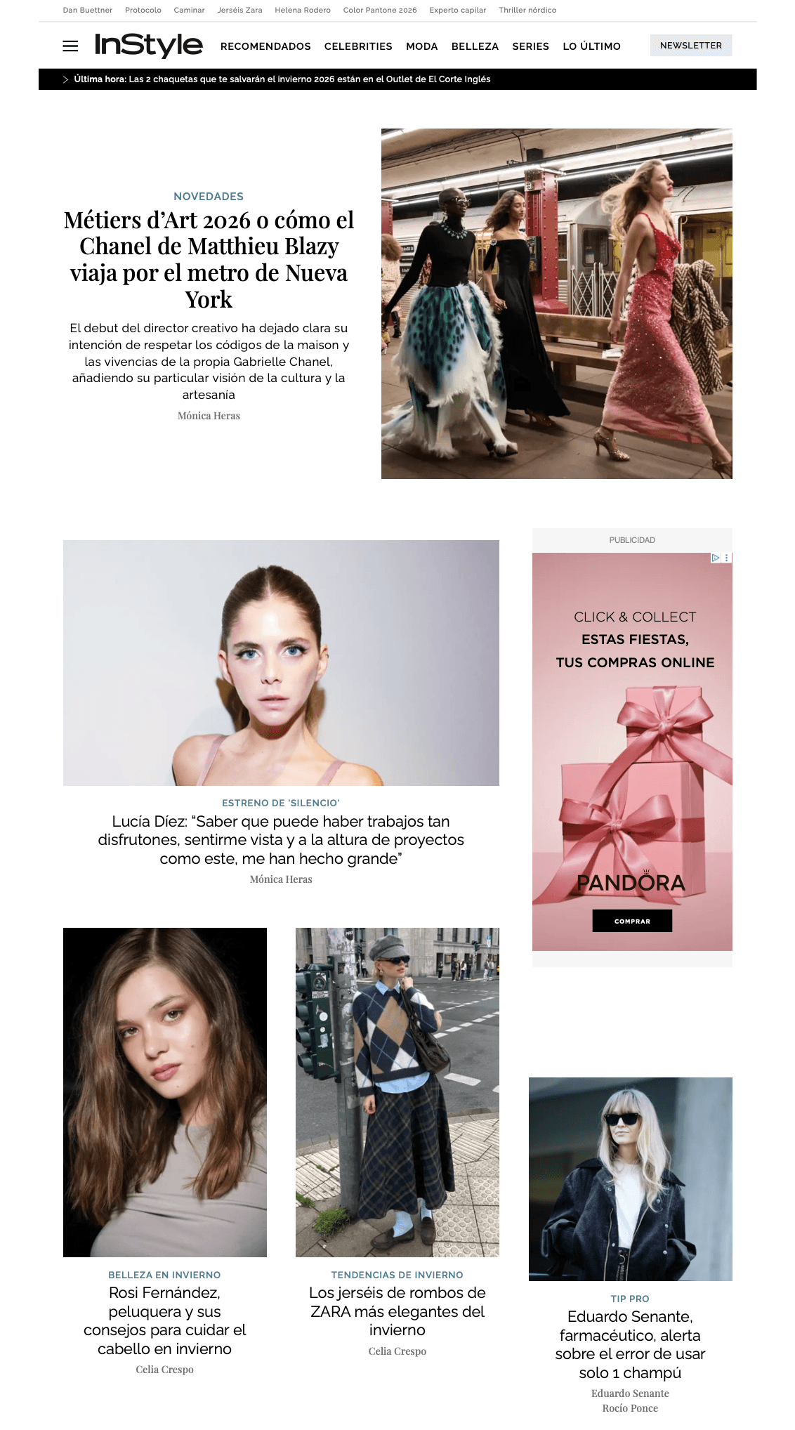
Before exploring the visual and structural improvements, it was essential to understand how readers typically interact with fashion and lifestyle content. This type of audience engages with blogs and digital magazines in a highly visual, fast-scanning manner, prioritizing inspiration and clarity over dense information.
Key behavioural patterns identified:
Users scan before they read; imagery often guides attention.
They expect a clear, elegant layout with minimal friction.
Excessive modules, sidebars or competing elements disrupt their reading flow.
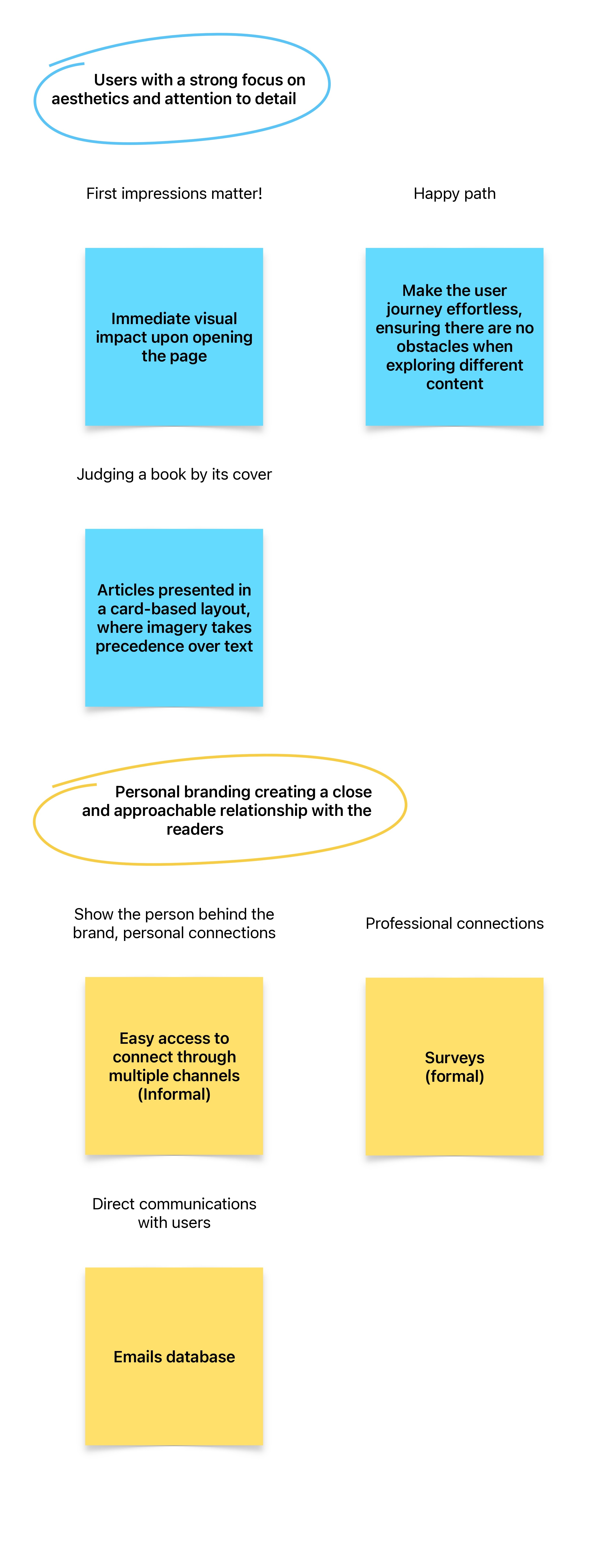
Users with a sensitivity to aesthetics
User needs
From this user understanding, concrete needs were defined:
A clear visual hierarchy that guides the user naturally.
Straightforward navigation, with visible and logically structure categories.
Visual prominence for photography, a key element in fashion content.
A lightweight reading experience, with proper spacing and readable typography.
A cohesive and modern visual identity across al pages.


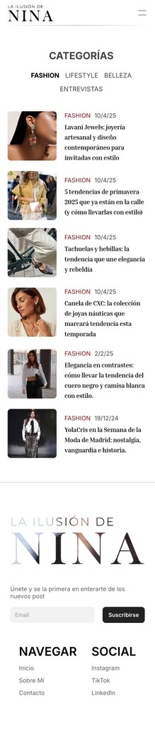
When starting the website design, we adopted a mobile-first approach. Since this is a blog where the majority of traffic comes from social media, primarily accessed via mobile deviced, it was essential to prioritize the experience on smaller screens. Therefore, our initial focus was to ensure that browsing the blog on mobile offers the most seamless and enjoyable user experience possible.


When starting the website design, we adopted a mobile-first approach. Since this is a blog where the majority of traffic comes from social media, primarily accessed via mobile deviced, it was essential to prioritize the experience on smaller screens. Therefore, our initial focus was to ensure that browsing the blog on mobile offers the most seamless and enjoyable user experience possible.

Desk-Home

Desk-Categories

Desk-About me

Desk-Contact