PortAventura
A roller coaster car that recovers its own braking energy, and the app that lets visitors see where it goes.
Every time a roller coaster brakes, it throws away energy as heat. A theme park does that thousands of times a day.
PortAventura Park burns through 22,000 MWh a year, most of it on ride machinery and lighting, at a moment when electricity prices were hitting record highs. And one of the clearest sources of waste is hiding in plain sight: the braking section at the end of every ride, where all that kinetic energy leaves as heat.
Our proposal was a Product-Service System with two halves. The physical half: a roller coaster car fitted with regenerative brakes — the same principle as an electric vehicle — designed to couple onto existing rides and charge batteries carried on board as the train slows down. No new ride, no new track.
We ran the project as a fictional company, emovery, pitching a ten-year rental and maintenance contract to the park. The digital half is where I worked. Energy recovery that nobody sees changes nothing about how a park is perceived, and at that time PortAventura had no app of any real depth. So we designed one: a companion for the whole visit that also makes the recovered energy visible and worth caring about.
The app only means something because there is real hardware behind it.
The car was designed as a retrofit: it attaches to coasters that already exist, so a park adopts it without rebuilding anything. Regenerative brakes convert the deceleration into current, and onboard batteries store it.
It sits at the rear of the existing train and is styled per attraction, so it never breaks the theming. It can't stop a train on its own either — it works alongside the conventional brake, shaving off speed while it generates.
Six rides were in scope: Dragon Khan, Shambala, Estampida, Furius Baco and Tren de la Mina. One ride yields 259 Wh. Across all six, over a year, that is 340,515 kWh.


The brake didn't fit inside the existing cars
The first concept put the regenerative brake inside the cars already running. On several rides there simply wasn't room, so the whole product was redefined as a separate car that couples on behind.
The energy couldn't go back to its own ride
We wanted the recovered energy to light the attraction that produced it — a neat story. Park substations don't work that way: they distribute evenly and can't route power to one installation. The energy goes into general consumption instead, and we had to change what the app promised accordingly.
The hatch was on the wrong face
The access hatch started on top of the car. An ergonomics study showed an operator connecting cables every night would struggle, so it moved to the side.
We benchmarked the apps of four major parks — Disney, Universal Studios, Six Flags and Parque Warner — to find out what visitors already expect from this kind of tool, and where nobody was looking. The overlap was almost total. Every app was built around the same job: helping you get through the day efficiently.
- 01Interactive map with geolocation
- 02Real-time waiting times
- 03Attraction and restaurant information
- 04Ticket purchase and storage
- 05Notifications for shows and events


Nobody was doing anything with sustainability. That gap was the whole opportunity. Energy-awareness data, rewards for choosing eco-friendly attractions and in-app photo purchasing were absent from every app we looked at. Two of those three were things PortAventura could already back up with hardware it was installing anyway.

Isabel, 21
- Blocked by
- No visibility of what sustainability claims actually mean.
- Wants
- To see how her own choices add up to something.

Jorge, 45
- Blocked by
- Companies that talk about the environment and do nothing concrete.
- Wants
- A day out that teaches his kids something without feeling like a lesson.

Carlos, 56
- Blocked by
- Venues that treat accessibility as an afterthought.
- Wants
- To know before he sets off whether he can actually get there.

Pilar, 71
- Blocked by
- Interfaces that assume you already know how they work.
- Wants
- To organise a day with her family without asking for help.
The map is the app, not a tab
The first structure was a screen of tabs you clicked through to reach each function. Geolocated maps had appeared in every app we benchmarked and were the feature people relied on most, so we tore that up and made the map the home screen — attractions, queues and services all reached from where you're standing, instead of from a menu.
Tie the energy to the ride you just took
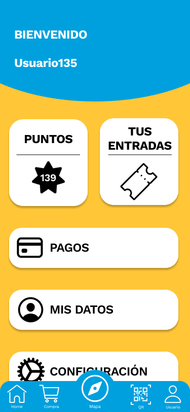
The recovered energy could have lived on an info page nobody opens. Instead it's attached to the coasters carrying our car, and it earns points that convert into real discounts — tickets, food, drinks. The sustainable choice becomes the one that also gets you something. Isabel gets her feedback loop; Jorge gets his teaching moment without the speech.
Pilar set the floor for the interface
Designing for a 71-year-old who finds modern apps hard to follow constrained every screen: one primary action per view, labels instead of icons alone, and nothing hidden behind a gesture. It made the app simpler for everyone else too.
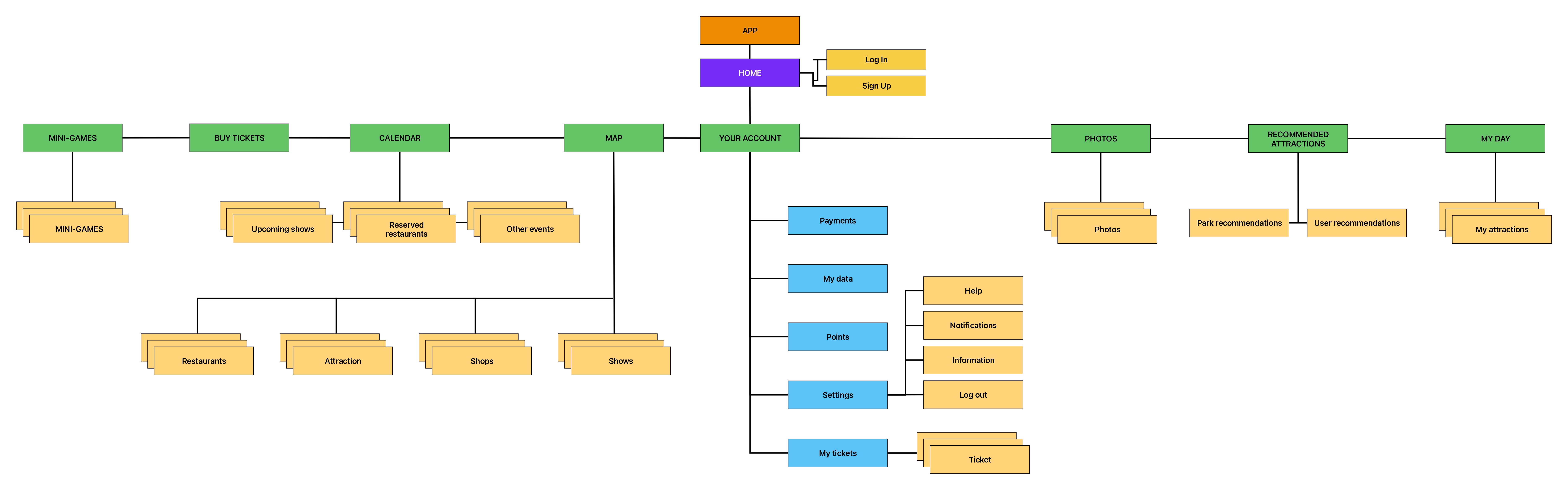
With the research settled, we mapped the sections and features of the app — what belongs on the surface, and what sits a level down.
Then we traced how a visitor completes the tasks that carry the most steps: buying a ticket with extras, booking a restaurant table, redeeming points, and checking what the last ride gave back.

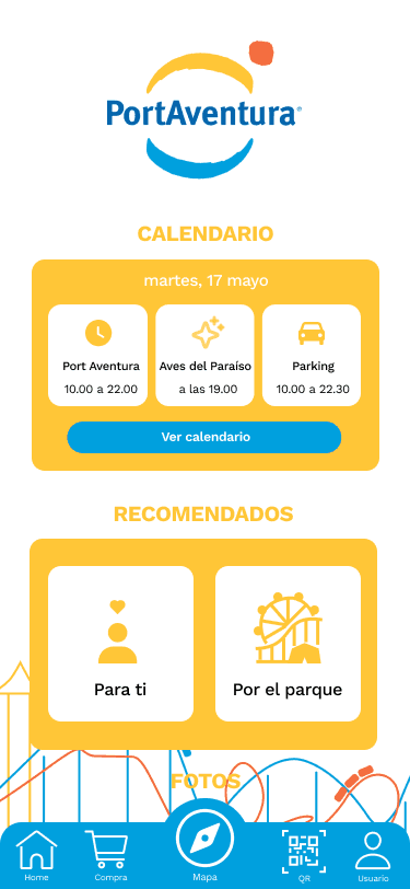
Layouts were sketched fast and thrown away faster, to settle navigation and hierarchy before anything got drawn properly.

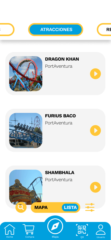
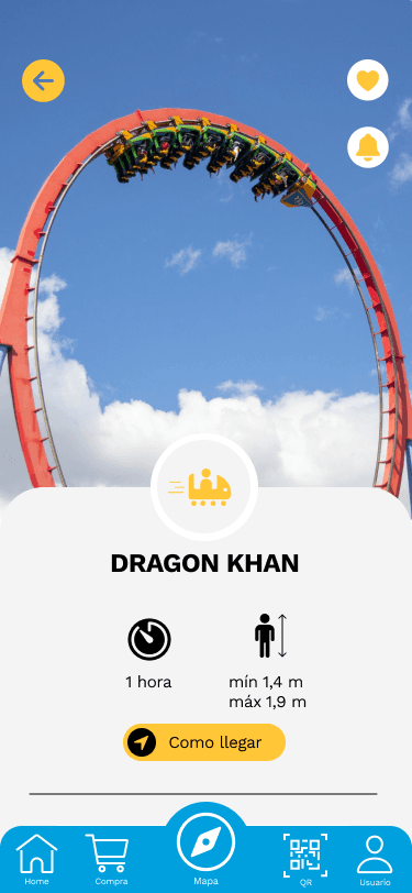
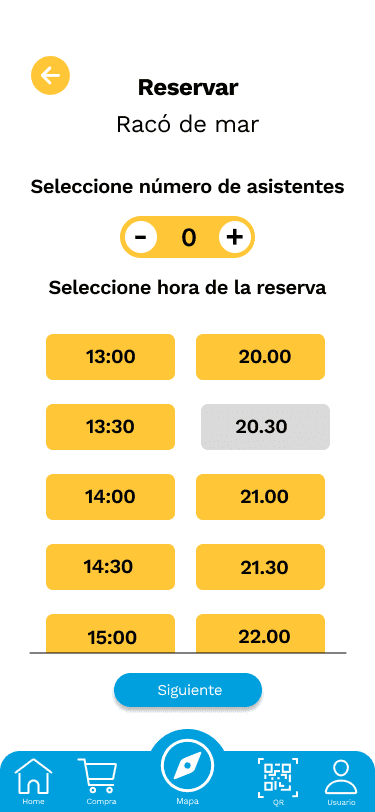
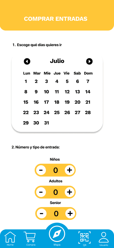
Five people, six tasks, one week. Every one of them said they would download it — and every one of them found something broken.
We recruited five participants matched against the personas: two who mapped to Jorge, two to Isabel and one to Carlos. Four of us ran the sessions, rotating the moderator so that whoever knew the participant was never the one running the test.
Each task came with a scenario and a timed objective. Buy three tickets for 17 July and reserve a parking space. Book a restaurant for 2pm for three people and redeem as many points as possible. Find rides for a child under 1.40 m with under 30 minutes of queue. Turn on wait-time alerts for Dragon Khan. Check which coaster you rode generated the most energy. Buy your photos and share them.
| Problem | Severity | Type | |
|---|---|---|---|
| 01 | Buttons too small, especially the +/− counters | Level 2 | Navigation difficulty (Fitts's Law) |
| 02 | Parking confirmation phrased so that "Yes" appeared to accept the booking when it changed it | Level 2 | Unfamiliar language |
| 03 | Turning on alerts gave no indication of what had been turned on | Level 2 | Visibility of system status |
| 04 | Nobody wanted to take the recommendations quiz | Level 3 | Wording and appeal |
| 05 | Buying photos took five steps when three would do | Level 3 | Task efficiency |
| 06 | Booking a restaurant returned you to the home screen with no confirmation | Level 2 | Visibility of system status |
Bigger targets
The passenger counters were too small to hit reliably. Enlarged and given more separation.


Say what the button does
"Do you want to change your space?" with Yes and No made people confirm the opposite of what they meant. Replaced with the two actual actions: Book, or Change.


Confirm what was switched on
Tapping the bell changed an icon and nothing else. Now it answers: we'll tell you when the wait drops below 30 minutes.


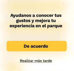
Ask for help, not for permission
Not one participant accepted the recommendations quiz. We rewrote the prompt around what they get, and stopped giving "later" the same visual weight as "yes".

Five steps down to three
Buying a photo meant scanning, selecting, saving, opening saved photos, selecting again and paying. Now you scan, select and buy.


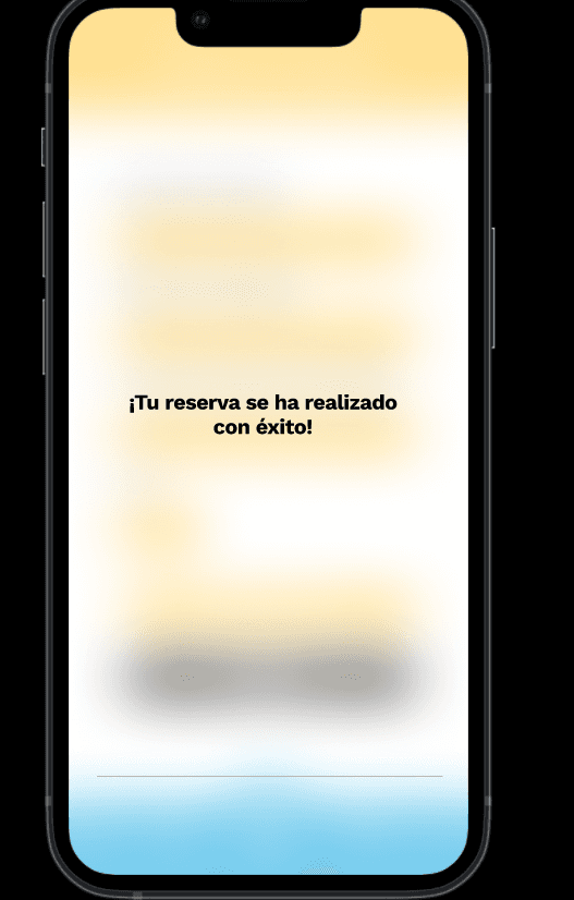
Close the loop on booking
Reserving a table dropped you back on the home screen with no acknowledgement, so nobody knew whether it had worked.
The test told us the app worked. It also showed us the limits of how we had run it.
Every problem we found was about language and feedback, not structure. Nobody got lost, nobody failed a task — but people repeatedly could not tell whether the thing they had just done had actually happened. Four of the six fixes were words and confirmations, not layout.
The sharper lesson was about the method. Because each task told participants what to achieve, they knew a bell icon meant notifications — we had given them the answer inside the question. Unprompted, several of them probably would not have found it. That is a limitation of a one-week test with scripted tasks, and it is the first thing I would change: fewer instructions, more open exploration.
The other thing I would carry forward is what people asked for that we never built. The ride history — the screen showing how much energy each coaster gave back — struck them as interesting but skippable. What they actually wanted was to compare themselves against other visitors. The reward loop we had designed was real; it just wasn't competitive enough.
Developed as a cross-module project at the University of Zaragoza, where one brief has to satisfy five subjects at once: design project management, user-product interaction, product and service design, marketing and design law, and materials and processes. At the time, PortAventura had no app of comparable depth.